Monday, October 15, 2012

Do or Do Not


digital media: Procreate app on iPad
click on thumbnail to view larger image

Another drawing test using the Procreate app on the iPad. I wanted to keep the sketch fairly loose, close to a scribble. And play with the hilights like I would when sketching with a liquid white out pen on ink. It was comfortable working in this technique as it feels somewhat familiar. I think i've found my prefered style for drawing on the iPad, but I'll continue exploring other methods.

Wednesday, October 10, 2012

Gobble Gobble...eh?


step 3: digital media: Procreate app on iPad
click on thumbnail to view larger image

step 2: digital media: Procreate app on iPad (unfinished)
click on thumbnail to view larger image

step 1: digital media: Procreate app on iPad (unfinished)
click on thumbnail to view larger image

My tribute to Canadian Thanksgiving was inspired by my desire to test out drawing on the new iPad using the Procreate app with a third party "Macally" stylus. The hardware (iPad/stylus) does not support pressure sensitivity. When compared with drawing on a Wacom tablet or Cintiq, the iPad lacks refinement and accuracy. The app "Procreate", is the best I've used on the iPad. But saying that, it still has a ways to go.

Saturday, June 16, 2012

Moor or Less...


step 4: digital media: Photoshop
click on thumbnail to view larger image

step 3: digital media: Photoshop (unfinished)
click on thumbnail to view larger image

step 2: digital media: Photoshop (unfinished)
click on thumbnail to view larger image

step 1: digital media: Photoshop (unfinished)
click on thumbnail to view larger image

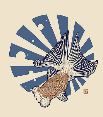
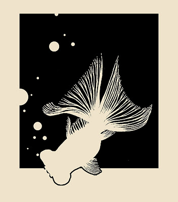
Another design created for the serigraph printing workshop. This one is based off a design created for a tattoo 10 years back, a Black Moor goldfish. It was always meant as a silhouette, but I've wanted to play around with the detailing of fish scales. I had started off with the traditional flat asian tattoo style of overlapping scales. But decided to try something a bit different while incorporating the circle motifs of the bubbles. Which was the same reason why I had gone with a round background stabilizer as opposed to the rectangular one. After adding colour the blue was too intense, and decided to break it up with the radiating lines within. Helped to balance out the negative spacing within the fish as well.

Friday, June 15, 2012

Serigraff-iti


Mr. Trooper - mixed media
click on thumbnail to view larger image

Just signed up for a serigraph printing workshop at a local studio called La Bourgeoise Serigraphie. The course requires us to supply our own design (2-3 colours) which will be printed on any surface/textile of our choosing, up to a maximum size of 8.5" X 11". For this I wanted to try a few designs which incorporate a heavy graphic element. One of which is this design based on the Imperial Stormtrooper character design by the late great Ralph McQuarrie for Star Wars. I'm a fan of stencil graffiti art for its pop/comedic sensibilites and strong imagery. The image was composed of 2 photographs which I had shot. One was from a wedding, the other was from the Star Wars Identities exhibiton. I'll let you figure out which was which.

Wednesday, February 22, 2012

My Angry Neighbor...


Totoro (character design by Hayao Miyazaki) - graphite
click on thumbnail to view larger image

Wanted to experiment with trying to draw Totoro in my own style...that is if I actually had a definitive "my own style". I have a few drawing styles depending on the subject matter (i.e. life/realism, cartoon, comics). I didn't go that far off from Hayao's original design. Wanted to give him a bit of an attitude in facial expression, so along with that I decided to add sharp angles in his design with the fur and the more angular arrow patterns on his chest. I'll try to see if I can go more stylized next time.