Sunday, September 29, 2013

How to Train a Turkey


day 1: Jimnie (medium) ballpoint pen on paper (W.I.P.)
click on thumbnail to view larger image


day 2: Jimnie (medium) ballpoint pen on paper (W.I.P.)
click on thumbnail to view larger image


day 3: Jimnie (medium) ballpoint pen on paper (W.I.P.)
click on thumbnail to view larger image


day 4: Sharpie (ultra fine/twin/chisel tip) permanent marker on paper (W.I.P.)
click on thumbnail to view larger image


day 5: Chartpak (chisel tip) colour markers, Sharpie (ultra fine) permanent colour markers & Sharpie (extra fine) water based white marker on paper
click on thumbnail to view larger image

Wanted to put together a sketch demo. Last year around this time I had done a sketch of a turkey around Thanksgiving (Canadian) on the iPad, this time I thought I'd do it on paper. Based off a Tim Flach photograph, my intentions were to have no game plan going into this exercise. I wanted to spread the work out through the week, never putting in too much time during each session. The initial base for the drawing was done using a Jimnie (medium) ballpoint pen. Lately I've been sketching more with pens to remove the crutch of an eraser while sketching. I prefer using a ballpoint pen because I'm able to control the line density and opacity more so that with a felt tip. I used the ballpoint from outline to full crosshatching. I've never used a ballpoint to that extent and found that the drawback to using one is the amount of pressure needed to be exerted to create dense line work can affect and/or damage the surface of the paper. Because of that setback I wasn't able to obtain enough contrast. On day 4 I decided to finish off the crosshatching using Sharpie permanent markers. To finish it off I was contemplating using chisel tip colour markers (wash) or fine point colour markers (hatching), and decided at the end to use both. Also using a white acrylic marker to bring back some highlights and definition.

Saturday, August 17, 2013

Yet Another Totoro


Totoro (character design by Hayao Miyazaki) - graphite
click on thumbnail to view larger image

One of my favorite characters to draw, because the shapes are so simple that proportion is the key. He's basically a big oval with arrows on his head. Been wanting to show texture with his fur. In earlier posts I had used a looping pattern for shading fur. This time I was referencing a Tim Flach photograph of a panda bear from his book "More Than Human", and decided to shade with contour hatching. Great book by the way if you want beautiful references of animal skin/fur/scales textures.

Tuesday, August 13, 2013

A Toy Story


mixed media: pen & digital
click on thumbnail to view larger image

This is a character design sheet for Danielle Ameen of Treefort Five - plush designer. I had backed Treefort Five's Kickstarter campaign which had a pledge option to have a plush custom made based on my own design. I decided to use an existing character - Mr. Muchacho! with a few design modifications for a plush (subject to further changes). Can't wait to see what she does with it!

Monday, August 12, 2013

Dumbo


pen & marker
click on thumbnail to view larger image

Monday, October 15, 2012

Do or Do Not


digital media: Procreate app on iPad
click on thumbnail to view larger image

Another drawing test using the Procreate app on the iPad. I wanted to keep the sketch fairly loose, close to a scribble. And play with the hilights like I would when sketching with a liquid white out pen on ink. It was comfortable working in this technique as it feels somewhat familiar. I think i've found my prefered style for drawing on the iPad, but I'll continue exploring other methods.

Wednesday, October 10, 2012

Gobble Gobble...eh?


step 3: digital media: Procreate app on iPad
click on thumbnail to view larger image

step 2: digital media: Procreate app on iPad (unfinished)
click on thumbnail to view larger image

step 1: digital media: Procreate app on iPad (unfinished)
click on thumbnail to view larger image

My tribute to Canadian Thanksgiving was inspired by my desire to test out drawing on the new iPad using the Procreate app with a third party "Macally" stylus. The hardware (iPad/stylus) does not support pressure sensitivity. When compared with drawing on a Wacom tablet or Cintiq, the iPad lacks refinement and accuracy. The app "Procreate", is the best I've used on the iPad. But saying that, it still has a ways to go.

Saturday, June 16, 2012

Moor or Less...

step 4: digital media: Photoshop
click on thumbnail to view larger image

step 3: digital media: Photoshop (unfinished)
click on thumbnail to view larger image

step 2: digital media: Photoshop (unfinished)
click on thumbnail to view larger image

step 1: digital media: Photoshop (unfinished)
click on thumbnail to view larger image

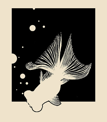
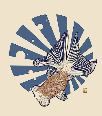
Another design created for the serigraph printing workshop. This one is based off a design created for a tattoo 10 years back, a Black Moor goldfish. It was always meant as a silhouette, but I've wanted to play around with the detailing of fish scales. I had started off with the traditional flat asian tattoo style of overlapping scales. But decided to try something a bit different while incorporating the circle motifs of the bubbles. Which was the same reason why I had gone with a round background stabilizer as opposed to the rectangular one. After adding colour the blue was too intense, and decided to break it up with the radiating lines within. Helped to balance out the negative spacing within the fish as well.